
Divercity.io
UI/UX Design Internship
Time: 3 months (Mar - June 2020)
Role: UI/Visual Design Intern
Team: Joanna P, Katty B, Stephanie H, Etsy A, Melrose H
UI/UX DESIGN
Divercity is an LA-based startup that provides a platform for job seekers from minority groups to be connected with diversity-driven companies.
1/ What I did
— Worked with the Lead Designer, UX Researcher, Product Manager, and Engineer to implement the design.
— Redesigned the landing page. Now live at divercity.io
— Prototyped product implementation features, including Messaging, Settings, and Profile.
2/ Design system
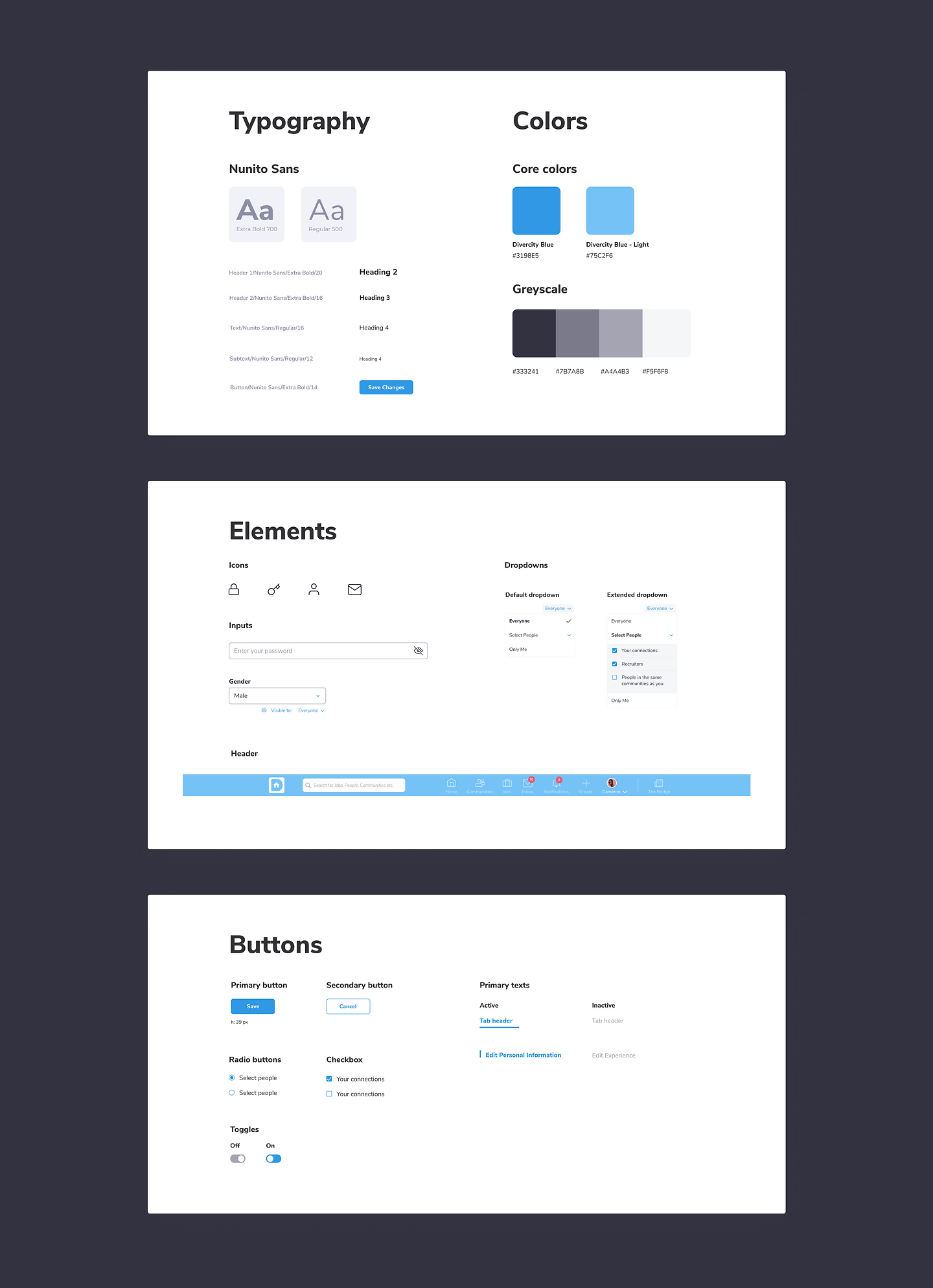
The following design system includes existing elements and new ones that came up with the design requirements (more information in section 3).
3/ Final design + Iterations
Product function: Settings—
After iterating on the wireframes with our UX Researcher, I created high-fidelity prototypes of some of the functions for our web-based product, then worked with the Software Engineer for development.
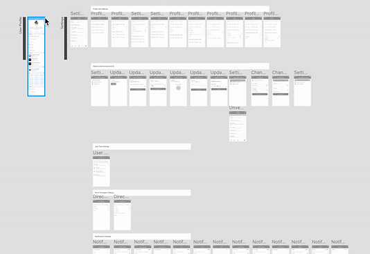
— The wireframe for the mobile version of Settings, which was used to develop the web version.
vs.
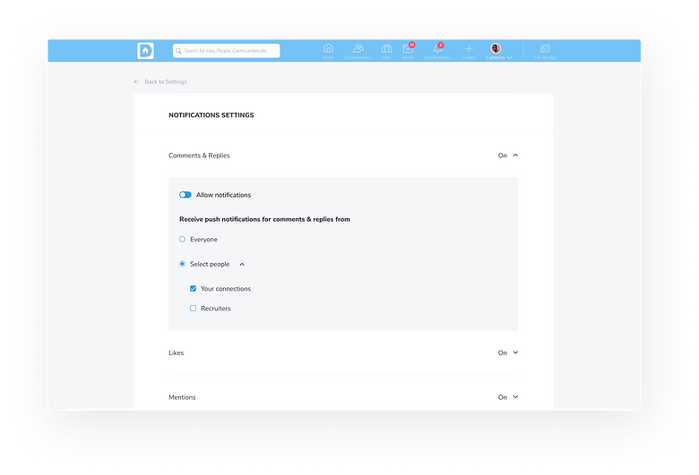
— The final prototype


Design explorations: Mobile vs. Web —
When transferring the wireframes for mobile into web, there were some considerations needed.
— Mobile products have less screen space, so for the sake of aesthetics, each click tends to correspond to a new screen. The "back" feature is also more accessible since there's less loading time.
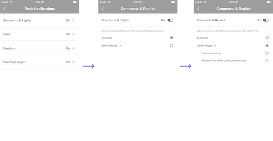
Navigating notifications settings on mobile: 2 screens + 1 dropdown
— The web version has more screen space; therefore, I used more dropdowns to maintain functionality without the need to navigate elsewhere.
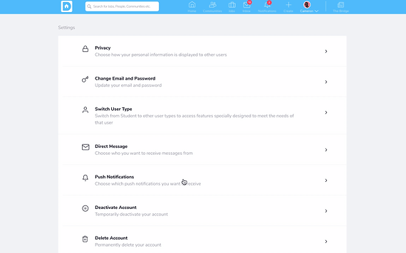
Navigating notifications settings on web: 1 screen + 2 dropdowns
— This design of the "double dropdown" was later on updated in the design system for further explorations.

— The rejected initial exploration seperates the dropdown to a new screen.

Product function: Profile —
— User Profile page


Design explorations: Accessibility —
One of Divercity's company values is inclusivity, thus was also a design principle I kept in mind while designing, specifically in the use of icons.
— The initial wireframe that used icons for the user's basic information and buttons (Add connections and Message)
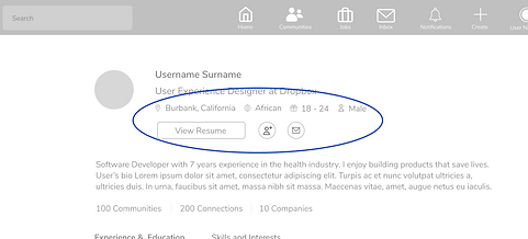
— However, these icons are not the best representations of their purposes, and can mean different things in other cultures.
— Solution: opting for both icons + texts for primary buttons, and texts for secondary button

— Another problem comes with the scalability of the icon that represents "Age range".
— Due to the time constraint of the project, I wasn't able to resolve the problem. However, the set of icons for the user's bio would be replaced with icons with thinner strokes (or be scaled larger) with fewer details.
4/ Takeaways
— I learned more about the hand-off process and how to work more efficiently with engineers.
— I learnt how to work with real-world constraints and how to adapt to them

